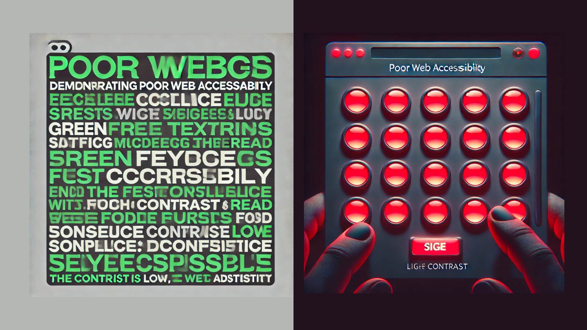
What Colors Are Hard to See for Color-Blind People? A Personal Perspective

What Colors Are Hard to See for Color-Blind People? A Personal Perspective


Feb 25, 2025
by jessicadunbar

I've been aware of color blindness for a long time—not because I have it, but because my partner and son both do, and it's hereditary.

This experience has given me a unique perspective on how color blindness affects daily life, especially on digital screens. Both my partner and son are red-green colorblind, meaning the color they love the most—green—is ironically the one they struggle with the most.

A Family Full of Green Enthusiasts Who Can't See Green

If you asked my partner what his favorite color is, he'd confidently tell you "green." There's an old joke about women dressing their husbands, and in our house, that’s not just because of fashion—it’s because 1 in 12 men are colorblind. That explains why neon green and bright red "tomato" hues are family favorites.

What Is Color Blindness?

Color blindness (or color vision deficiency) affects how people perceive certain colors. It happens when the cones in the eye, responsible for detecting color, don’t function correctly or are missing. The most common type is red-green color blindness, which affects up to 8% of men and 0.5% of women.

Types of Color Blindness

  • Red-Green Color Blindness (Deuteranomaly & Protanomaly): Reds and greens appear indistinguishable, green may look brownish or grayish, and some shades of red can appear dark brown or black.
  • Blue-Yellow Color Blindness (Tritanomaly & Tritanopia): Blues and yellows blend together. Purple looks like blue, and pink and orange become difficult to differentiate.
  • Complete Color Blindness (Monochromacy): The world appears in shades of gray. People with this condition often struggle with low-light visibility.

How Color Blindness Affects Digital Devices

Most of the time, color blindness is just an occasional inconvenience. But on digital screens, it can be a real challenge. Here’s how:

1. Red & Green Indicators Don’t Work

Many apps and websites rely on red and green for status indicators:

  • Green means “go” (success, active, good).
  • Red means “stop” (error, warning, bad).

For someone who can’t distinguish red from green, this system is useless. My son has had moments where he’s staring at an app and asking, “Is this button red or green?”

Red & Green Indicators Don’t Work

This is a success alert—check it out!
This is a danger alert—check it out!
This is a warning alert—check it out!

Use Icons

This is a success alert—check it out!
This is a danger alert—check it out!
This is a warning alert—check it out!

Solution:

  • Use icons and text labels, not just color.
  • A ✅ checkmark for success, ❌ an X for failure.

2. Video Games & User Interfaces Can Be Confusing

My Son loves video games, but many games use color-coded maps, enemies, and power-ups. When a game tells him, “Avoid the red zones and collect the green items,” he’s already at a disadvantage.

Solution:

  • Many modern games now offer colorblind modes that swap out colors for more distinct hues.
  • Customizable UI settings allow users to adjust colors to their vision.

3. Websites With Poor Contrast Are Frustrating

Some websites use low contrast colors, making text hard to read. This is a big issue for color-blind users, especially when designers choose:

  • Green text on a gray background
  • Red buttons on dark backgrounds
Green on Grey - Red Buttons on a Black background

Solution:

  • Use high-contrast color schemes.
  • Test colors with a contrast checker like WebAIM’s Contrast Checker.

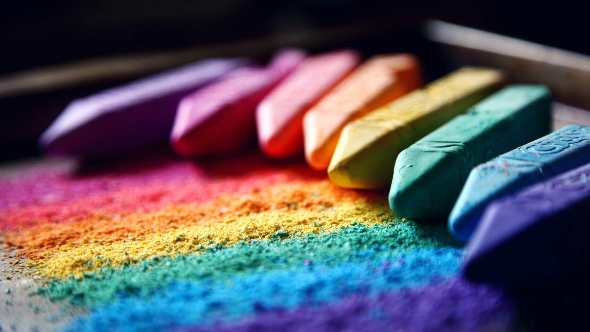
What Colors Are Hard for Color-Blind People to See?

Color Vision Problematic Color Pairs
Red-Green Blindness Red & green, brown & green, blue & purple
Blue-Yellow Blindness Blue & green, yellow & pink
Complete Color Blindness All colors appear in shades of gray

The Problem With "Green Means Good"

One of the funniest ironies is how much my partner loves green—a color he doesn’t see properly. He’ll proudly pick out a new shirt when we are shopping, only for me to say, “You know that’s Neon Green, right?” He’d be dressed in fluorescent green, in all sports.

This makes designing accessible digital experiences incredibly important. Many financial apps, data dashboards, and error messages rely on green vs. red, assuming everyone can see the difference.

Below is an example of an app dashboard that uses red and green to indicate losses and gains.

Success with icons in the finance report

Many data dashboards use red and green highlights to show positive and negative trends, often with poor contrast.

Bad example with no icons or indications

How to Design for Color-Blind Users

  • Avoid color-only distinctions—use shapes, labels, and icons.
  • Use contrast checkers like WebAIM Contrast Checker to ensure text is readable.
  • Implement colorblind modes in apps and games for customization.

Conclusion: Making the Digital World More Inclusive

Color blindness may seem like a small issue, but for millions of people, it affects how they interact with technology, read websites, and navigate everyday life.

For my partner and son, it’s a constant reminder that not everyone sees the world the same way. The good news? Developers and designers can make small changes that create a huge impact.

Want to Learn More About Web Accessibility?