
Have you ever found yourself endlessly clicking through a website, trying to locate that one piece of information you need? It’s frustrating, isn’t it? We’ve all been there, lost in a maze of links and menus, wondering why finding what we’re looking for has to be so difficult.
Table Of Contents
Why Navigation Matters
Types of Navigation Menus
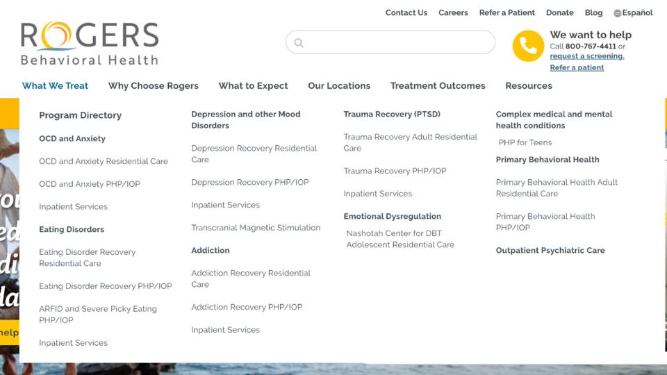
Mega Menus
Breadcrumbs
Sticky Navigation
Search
Dropdown Menus
Sidebar Menus
Footer Navigation
Designing Web Menus
Implementing Menu Design Principles
Information Architecture and Site Structure
Best Practices for Navigation Links
94%
of Consumers Say Your Website Must Be Easy to Navigate
Good site navigation is like a well-organized roadmap. It guides visitors to their destination quickly and efficiently, enhancing their overall experience. In this post, we'll explore some of the best navigation add-ons available for Concrete CMS that can transform your website into a user-friendly, easily navigable space.
We’ll cover a variety of tools, including mega menus, breadcrumbs, sticky navigation, search enhancements, dropdown menus, side navigation panels, and mobile navigation solutions. Let’s dive in and find the perfect tools to enhance your site's navigation!
Why Navigation Matters
User Experience
Intuitive navigation is crucial for a positive user experience. When visitors land on your website, they should be able to find what they need quickly and effortlessly. Imagine walking into a store where the aisles are poorly labeled, and products are scattered randomly; you’d likely leave frustrated. Similarly, a website with clear, organized navigation helps users locate information easily, making them more likely to stay longer, engage with your content, and return in the future. Good navigation reduces bounce rates and increases the likelihood of conversions, whether that means making a purchase, signing up for a newsletter, or contacting your business.
SEO Benefits
Well-structured navigation is not just user-friendly but also search engine-friendly. Search engines like Google use your site’s navigational structure to crawl and index content. Clear, logical navigation helps search engines understand the hierarchy and importance of your pages, which can improve your site’s search engine ranking. For example, a site map and breadcrumb navigation can make it easier for search engines to index your site, leading to better visibility in search results. Additionally, proper navigation ensures that link equity is distributed throughout your site, boosting the SEO performance of individual pages.
Types of Navigation Menus
Mega Menus
Mega menus are expansive dropdown menus that showcase multiple options and subcategories in a single, comprehensive view.
Unlike standard dropdown menus that list options in a single column, mega menus often display multiple columns of choices, making them ideal for websites with extensive content or a variety of product categories.
Benefits of Mega Menus:
- Better Organization: Mega menus help to neatly organize complex site structures, allowing users to see all their options at a glance. This is particularly useful for e-commerce sites, large blogs, or corporate websites with multiple departments and services.
- Enhanced User Experience: By presenting more options in an accessible manner, mega menus reduce the number of clicks needed to find information, thus improving the overall user experience.
- Visual Appeal: They can include images, icons, and other design elements to make navigation more engaging and visually appealing.
Recommended Tools:
- Native Autonav Block from Concrete CMS: Concrete CMS offers a native Autonav block that provides a straightforward way to create navigation menus, including the option to configure it as a mega menu. This block is flexible and can be customized to fit various navigation needs. Learn more
- Mega Menu Add-on: For those looking for more advanced features and customization options, the Mega Menu Add-on available in the Concrete CMS marketplace is an excellent choice. This add-on offers enhanced functionality, allowing you to create sophisticated mega menus with ease. Explore the Mega Menu Add-on
By leveraging these tools, you can enhance your site’s navigation, making it easier for visitors to find what they’re looking for and enjoy a more seamless browsing experience.
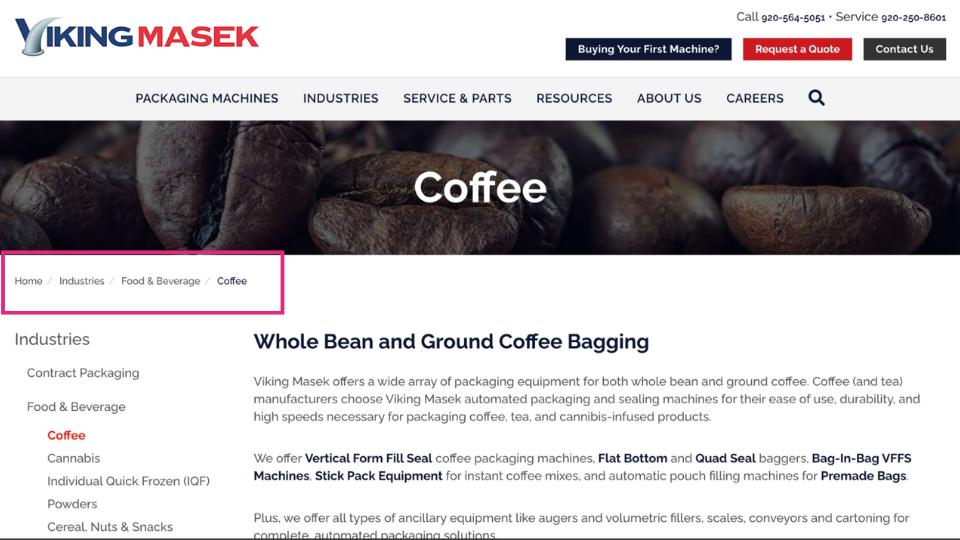
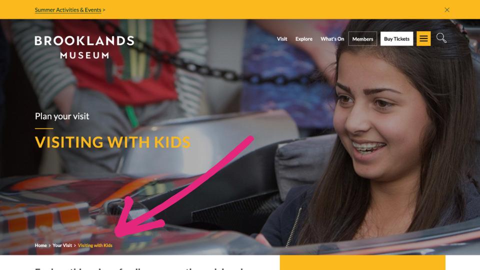
Breadcrumbs
Breadcrumbs are a type of secondary navigation aid that helps users understand their location within the hierarchy of a website. Typically displayed at the top of a page, breadcrumbs show a trail from the homepage to the current page, allowing users to see the path they have taken. Each segment of the breadcrumb trail is a clickable link, providing an easy way to navigate back to previous sections of the site.
Benefits:
- Enhanced User Navigation: Breadcrumbs improve the user experience by providing a clear path back to higher-level pages. This helps users avoid getting lost and makes it easier to navigate large websites.
- Reduced Bounce Rates: By offering an easy way to return to previous pages, breadcrumbs can reduce bounce rates. Users are less likely to leave the site if they can easily find their way back to sections they are interested in.
- SEO Advantages: Breadcrumbs provide additional internal links, helping search engines understand the structure and hierarchy of your site. This can improve indexing and potentially boost your site's SEO performance.
Concrete Breadcrumbs: Concrete CMS offers built-in support for breadcrumbs, making it simple to add this navigation feature to your website. The native breadcrumb functionality in Concrete CMS can be easily implemented and customized to fit the design and structure of your site. This ensures that users always know where they are and can navigate your content effortlessly. By utilizing Concrete CMS’s breadcrumb feature, you can enhance both user experience and site navigation, aligning with the platform’s focus on ease of use and robust functionality.
With these benefits in mind, incorporating breadcrumbs into your website's navigation strategy can significantly improve how users interact with and navigate through your content.
Sticky Navigation
Sticky navigation, also known as fixed navigation, is a type of menu that remains visible and fixed in place as users scroll down a webpage.
This means that important links and menu items stay accessible at the top or side of the screen, regardless of how far a user scrolls.
Benefits:
- Accessibility: Sticky navigation keeps key menu items and links constantly in view, making it easier for users to access important sections of your site without needing to scroll back up.
- Improved User Experience: By reducing the effort required to navigate the site, sticky navigation enhances the overall user experience. Users can move quickly between sections, improving the flow of interaction.
- Increased Engagement: Keeping navigation links readily available can encourage users to explore more of your site, potentially increasing engagement and the time spent on your site.
- Consistency: A consistent navigation experience across all pages ensures that users always know where to find the menu, reducing confusion and enhancing site usability.
Recommended Tools:
- Add Navigation Menu Add-on: This add-on for Concrete CMS allows you to create a sticky navigation menu easily. It offers various customization options to ensure the sticky menu fits seamlessly with your site’s design and functionality. Explore the Add Navigation Menu Add-on
By implementing sticky navigation using these tools, you can significantly improve the accessibility and user experience of your website, ensuring that important navigation elements are always within reach for your visitors.
Search
A powerful search feature is essential for any website, particularly those with a large amount of content. It allows users to quickly and easily find the specific information they are looking for without having to navigate through multiple pages. Advanced search tools often include features like filtering, autocomplete, and relevancy ranking to provide more precise and helpful results.


Benefits:
- Improved User Experience: Advanced search tools streamline the process of finding content, making it quicker and more efficient. This enhances user satisfaction and keeps visitors on your site longer.
- Increased Engagement: When users can easily find relevant content, they are more likely to explore additional pages, increasing overall engagement and the time spent on your site.
- Better Accessibility: Powerful search capabilities make your website more accessible to users with different needs and preferences, ensuring that everyone can find the information they require.
- Enhanced Navigation: Search enhancements can serve as an additional navigation tool, complementing your site's menus and links by providing an alternative way to locate content.
Recommended Tools:
- Concrete CMS Search Block: The native search block in Concrete CMS is a versatile tool that allows you to add basic search functionality to your website. It can be customized to fit the design and needs of your site.
By integrating these search enhancement tools into your Concrete CMS website, you can significantly improve the user experience, making it easier for visitors to find the content they need quickly and efficiently.
Dropdown Menus
Dropdown menus are a type of navigational tool that reveals a list of links or submenus when a user hovers over or clicks on a menu item.
Commonly used in website navigation bars, dropdown menus organize multiple related links under a single parent item, helping to keep the navigation bar clean and uncluttered.
Benefits:
- Simplified Navigation: Dropdown menus allow users to easily access a variety of links from a single menu item. This organization reduces the need for a user to navigate through multiple pages, streamlining their journey through the website.
- Space Efficiency: By grouping related links under a single menu item, dropdown menus save valuable screen space. This helps maintain a clean and professional appearance, especially important for sites with extensive content or numerous categories.
- Enhanced User Experience: Users can quickly find and access the specific sections or pages they are looking for, improving their overall experience and satisfaction with the website.
- Improved Organization: Dropdown menus help in categorizing and organizing content logically, making it easier for users to understand the structure of your site.
Recommended Tools:
- Auto-Nav Block: Concrete CMS offers a native Auto-Nav block that supports dropdown menu functionality. This block can be customized to create dynamic and user-friendly dropdown menus, adapting to the specific needs of your site. Learn more about the Auto-Nav Block
By implementing effective dropdown menus using tools like the Auto-Nav block in Concrete CMS, you can significantly enhance your website’s navigational structure, making it easier for users to find and access the information they need.
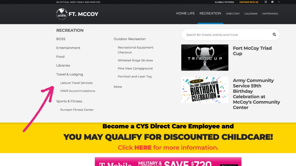
Sidebar Menus
Side navigation panels, or sidebar menus, are vertical menus typically positioned along the left or right side of a webpage. They provide an alternative to top navigation bars, offering a persistent menu that users can access while scrolling through the page.
Side navigation panels are especially useful for websites with a lot of content, as they allow users to navigate through various sections without losing their place on the page.

Benefits:
- Persistent Access: Sidebar menus remain visible as users scroll, providing constant access to navigation links without needing to scroll back to the top of the page.
- Better Organization for Content-Heavy Sites: For websites with extensive content, such as blogs, e-commerce sites, or documentation portals, side navigation panels help categorize and display numerous links in an organized manner, making it easier for users to find specific sections or pages.
- Enhanced User Experience: By keeping navigation readily accessible, sidebars improve user experience by reducing the number of clicks needed to reach desired content. This can lead to increased user engagement and satisfaction.
- Space for Additional Content: Sidebars can also be used to display additional content, such as recent posts, popular articles, or advertisements, without cluttering the main content area.
Recommended Tools:
- Page List Block or Auto-Nav: Concrete CMS offers built-in blocks like the dynamic Page List Block and Auto-Nav, which can be used to create dynamic and customizable side navigation panels. These blocks allow you to display a list of pages or a navigation menu based on your site's structure.
- Enlil Page List Add-On: This add-on enhances the functionality of the default Page List Block, providing more customization options and improved display features. It’s ideal for creating sophisticated sidebar menus that can adapt to various content structures. Explore the Enlil Page List Add-On
By utilizing these tools, you can effectively implement sidebar menus on your Concrete CMS website, ensuring that your content-heavy site remains navigable and user-friendly.
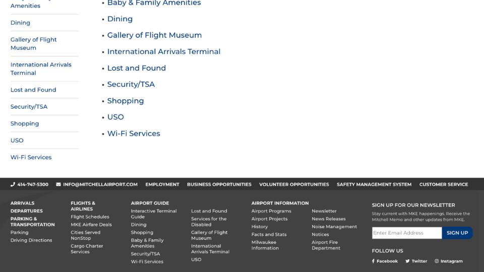
Footer Navigation
Definition and Importance: Footer navigation refers to the collection of links and information located at the bottom of a webpage. This secondary navigation area provides additional access points to important parts of the website, often including links to contact information, policies, site maps, and other essential resources.
The footer is typically present on every page of a website, ensuring consistent accessibility for users.
Benefits:
- Enhanced User Experience: Provides a consistent place for users to find key links without scrolling back to the top. Helps users find important but less frequently accessed pages, improving overall site navigation.
- SEO Advantages: Boosts search engine optimization by creating more internal links, which helps search engines crawl the site more effectively. Encourages users to explore more of the site, potentially increasing page views and reducing bounce rates.
- Branding and Trust: Reinforces brand identity by providing a consistent navigation experience across all pages. Inclusion of links to privacy policies and terms of service builds trust with users.
Best Practices for Footer Navigation Design:
- Keep It Simple and Organized: Use clear headings and group related links together for easy scanning. Avoid clutter by including only the most important links.
- Prioritize Important Links: Place essential links such as Contact Information, About Us, Privacy Policy, and Terms of Service prominently.
- Maintain Consistent Design: Ensure the footer menu design aligns with the overall site design for a cohesive look and feel. Use readable font sizes and adequate spacing between links.
- Incorporate Social Media Links:
- Add icons linking to your social media profiles to encourage user engagement across different platforms.
- Responsive Design:
- Ensure the footer menu is mobile-friendly and looks good on all devices.
- Include a Call to Action:
- Add a call-to-action (CTA) such as signing up for a newsletter or following your social media accounts.
- Use Clear and Descriptive Labels:
- Ensure link labels are straightforward and descriptive so users know exactly where they will be taken.
- Legal and Compliance Links:
- Include links to legal disclaimers, privacy policies, and terms of use to ensure compliance with regulations.
Recommended Add-Ons for Footer Navigation in Concrete CMS:
- Page List Block: This native Concrete CMS block can be customized to display a list of pages in the footer, helping to create an organized footer navigation menu. It allows you to specify which pages to include and how they should be displayed.
- Auto-Nav Block: Another native block in Concrete CMS, the Auto-Nav block can be used to automatically generate a navigation menu based on your site's structure. This block is versatile and can be configured to suit various navigation needs, including footer menus. Learn more about the Auto-Nav Block
By leveraging these tools and following best practices, you can design an effective and user-friendly footer navigation menu that enhances your Concrete CMS website’s usability and SEO performance.
Designing Web Menus
Menu Design Principles:
Balancing Aesthetics and Functionality
- Visual Appeal: Your menu should complement the overall design of your website. Use a color scheme that matches your brand, and ensure the typography is clear and readable.
- Intuitive Layout: Organize menu items logically, grouping related links together. Use familiar symbols and icons to help users quickly understand menu items.
- Responsive Design: Ensure your menu looks good and works well on all devices, including desktops, tablets, and smartphones. A responsive menu adapts to different screen sizes and touch interfaces.
Ensuring Accessibility
- Keyboard Navigation: Make sure users can navigate through the menu using a keyboard. This includes using the tab key to move through links and the enter key to select options.
- Screen Readers: Design your menu so it can be easily read by screen readers. Use ARIA (Accessible Rich Internet Applications) attributes to provide additional context for users who rely on these tools.
- Color Contrast: Ensure there is sufficient contrast between the text and background colors to make the menu items readable for users with visual impairments.
- Descriptive Labels: Use clear and descriptive labels for all menu items. Avoid jargon and ensure that each link clearly indicates where it will take the user.
By following these principles, you can design web menus that are both visually appealing and highly functional, ensuring a positive experience for all users, including those with disabilities. For a more comprehensive guide, refer to the accessible navigation guide on the Concrete CMS website.
Implementing Menu Design Principles
Information Architecture and Site Structure
Importance of Information Architecture:
- User Experience: Good information architecture (IA) makes it easy for users to find the information they need quickly and efficiently, enhancing their overall experience on your site.
- Content Organization: IA helps organize content logically, making it easier to manage and update, ensuring that all information is accessible and relevant.
- Navigation Efficiency: A well-structured IA provides a clear roadmap for users, reducing confusion and improving navigation flow.
- SEO Benefits: Search engines use IA to understand the structure and relevance of your content, which can improve indexing and search rankings.
Steps to Create an Effective Site Map:
- Define Goals and Objectives: Understand the purpose of your website and what you want to achieve. This helps in creating a site structure that aligns with your business goals.
- Conduct User Research: Gather information about your target audience, including their needs, behaviors, and preferences. This helps in designing a user-centric IA.
- Inventory Content: List all the content you have and categorize it. Identify gaps and redundancies to ensure comprehensive coverage.
- Create a Hierarchical Structure: Organize content into a hierarchical structure, starting with broad categories and breaking them down into subcategories. Use tools like mind maps or IA software.
- Develop Wireframes and Prototypes: Create visual representations of your site structure to test and refine the IA. This helps in identifying potential issues and making necessary adjustments.
- Test with Users: Conduct usability testing with real users to validate your IA. Use their feedback to make improvements.
Organizing Content for Optimal Navigation
Grouping Related Content:
- Categorization: Group related content into categories and subcategories. This helps users find similar information easily.
- Consistent Labeling: Use clear and consistent labels for categories and links to avoid confusion.
- Content Chunking: Break down large amounts of content into smaller, manageable chunks. This improves readability and navigability.
Creating Intuitive User Pathways:
- Primary Navigation: Ensure the primary navigation menu is clear and accessible, featuring the most important sections of your site.
- Secondary Navigation: Use secondary menus, breadcrumbs, and sidebars to provide additional navigation options without overwhelming users.
- Call to Actions (CTAs): Place CTAs strategically to guide users towards desired actions, such as signing up for a newsletter or making a purchase.
- User Flow Testing: Test user pathways to ensure they are intuitive and align with user expectations. Make adjustments based on user feedback.
Best Practices for Navigation Links
- Descriptive Anchor Text: Use clear and descriptive anchor text for internal links to help users and search engines understand the linked content.
- Avoid Overlinking: Don’t clutter pages with too many internal links, as this can dilute their effectiveness and confuse users.
- Logical Structure: Ensure internal links follow a logical structure, reflecting the site hierarchy and content relationships.
- Regular Updates: Regularly review and update internal links to ensure they point to the most current and relevant content.
- Sitemaps: Create and submit XML sitemaps to search engines to enhance crawling and indexing of your site’s pages.
By focusing on these aspects of information architecture, site structure, and navigation, you can create a website that is easy to navigate, user-friendly, and optimized for search engines, ultimately improving both user satisfaction and search performance.
Conclusion
Now it’s time to put these best practices into action. Implement these strategies on your website to improve user satisfaction, increase engagement, and boost your site’s search engine performance. Keep learning and adapting to new trends and technologies to ensure your site remains user-friendly and accessible.
By continually refining your web menus and navigation, you can create a positive and efficient browsing experience that keeps visitors coming back.
Sources
- Clutch. (n.d.). Top 6 website features people value. Clutch. Retrieved July 23, 2024, from https://clutch.co
- Section508.gov. (n.d.). Accessibility testing for websites and software. Section508.gov. Retrieved July 23, 2024, from https://section508.gov
- Small Business Trends. (n.d.). Easy website navigation is important. Small Business Trends. Retrieved July 23, 2024, from https://smallbiztrends.com/easy-website-navigation-is-important/