
When it comes to web design, color isn’t just about making things look pretty—it plays a vital role in how people experience and interact with content. Approximately 8% of men and 0.5% of women have some form of color vision deficiency (color blindness).
For many users, particularly those with visual impairments, the right color combinations can mean the difference between being able to read and understand a website or struggling to make sense of the information. This is why color choices need to go beyond aesthetics and focus on accessibility.
So how can you balance both style and accessibility in your design? This is where tools like Contrast Checkers and tools come into play. Together, they help designers ensure their color palettes not only look great but are also accessible to all users.
What is Web Accessibility? – Simply put, web accessibility involves designing a website to ensure equal access and usability for all individuals, regardless of visual, hearing, cognitive, or motor disabilities.
Image sourced from adatitleiii.com
What is Contrast Ratio?
At the core of accessible color design is the concept of contrast ratio. Contrast ratio refers to the difference in brightness between two colors—usually text and background—on a website. This ratio measures how well the colors stand out from each other, directly affecting the readability of the content.
The contrast ratio scale ranges from 1:1 (no contrast, like white text on a white background) to 21:1 (maximum contrast, such as black text on a white background). According to the Web Content Accessibility Guidelines (WCAG), there are minimum contrast ratios that ensure readability:
- 4.5:1 for normal text (small text).
- 3:1 for large or bold text.
By meeting these standards, you’re ensuring your site is readable for everyone, including people with low vision or color blindness. And as a bonus, high-contrast color combinations tend to improve the overall user experience by making content clearer and more visually accessible.
Why Accessibility in Color Matters
Color contrast isn’t just a technical requirement—it’s about making sure your design works for everyone. Imagine trying to read important medical information on a healthcare website, only to find that the text blends into the background. For users with low vision or color blindness, this isn’t just frustrating—it can be a real barrier to accessing critical information.
This is where the concept of the "curb-cut effect" comes in. Originally referring to how sidewalk ramps for wheelchair users also benefit people pushing strollers or carrying heavy loads, this principle applies to web design as well. When you design for a specific audience, like those with vision impairments, you often create a better experience for all users.
A perfect example is healthcare website design. Using accessible color contrasts ensures that vital information is readable for everyone, regardless of their visual abilities. It’s not just about compliance—it’s about delivering a seamless and inclusive user experience.
How to Ensure Accessible Color Contrast
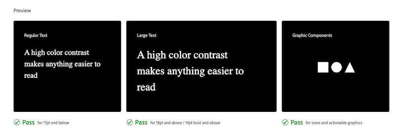
To create accessible websites, you need to use color schemes that meet WCAG standards. A contrast ratio of at least 4.5:1 is recommended for normal text, while large or bold text can go down to 3:1. The good news? You don’t have to guess whether your color choices meet these requirements—tools like Adobe Color’s Contrast Checker are here to help.
Steps to Check Contrast:
- Use a Contrast Checker Tool: Tools like Adobe Color’s Contrast Checker or ANDI by SSA https://www.ssa.gov/accessibility/andi/help/install.html allow you to input color values (such as hex codes) for text and background. If your project is already designed, you can upload a screenshot to test the color combinations.
- Test Your Design: The tool will give you the contrast ratio and tell you if your colors pass WCAG standards. This helps you ensure that your design is accessible for all users.
- Adjust Colors for Compliance: If the contrast ratio doesn’t meet the required standards, you can adjust the colors by either darkening or lightening one of them until the ratio improves. This allows you to keep your design while ensuring accessibility.
- Set a Target Ratio: Aim for a WCAG AA rating (4.5:1 for normal text), or if you want to be even more inclusive, aim for AAA (7:1) compliance. While AAA compliance can limit color choices, aiming for AA provides a great balance between design freedom and accessibility.
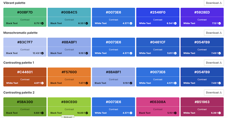
How can I generate an accessible color palette quickly
Several free online tools can help you create accessible color palettes with minimal effort:
- Randoma11y generates random accessible color combinations that meet WCAG contrast guidelines.
- Color Safe lets you browse pre-made accessible color combinations or create your own
- The Accessible Color Palette Generator by Venngage allows you to input a HEX code and discover accessible palettes based on that color.
Easy Tools for Accessible Design
Adobe Color’s Contrast Checker is an invaluable tool for making sure your color schemes are accessible. Simply input the text and background colors or upload a screenshot of your design, and the tool will give you a contrast ratio and a pass/fail rating according to WCAG standards. If the contrast is too low, you can easily adjust it with sliders to achieve the right balance.
ANDI - Accessible Name and Description Inspector - ANDI is a web accessibility inspection tool. For many web developers, accessibility is an unfamiliar and complex territory and therefore often neglected. ANDI bridges the gap between developers and end users by revealing where accessibility issues occur on the page. To accomplish this, it analyzes the HTML of the web page being tested and extracts accessibility related markup.
By integrating tools you can create designs that are not only compliant but also visually appealing. Concrete CMS simplifies the process of managing accessible content, so whether you’re working on a corporate intranet or a public-facing website, you can ensure it’s accessible to all users from the start.
Check for Accessibility: How to Ensure Your Colors Meet Standards
To ensure your colors meet accessibility standards, follow these simple steps:
- Use a Contrast Checker Tool: Input the hex codes for text and background colors or upload your design to a tool like Adobe Color’s Contrast Checker.
- Test Your Design: The tool will provide a contrast ratio and indicate if your design meets WCAG guidelines.
- Adjust Colors for Compliance: If the ratio doesn’t meet the requirements, adjust the colors by darkening or lightening one until the ratio improves.
- Set a Target Ratio: Aim for AA compliance (4.5:1 for normal text). For higher levels of accessibility, aim for AAA compliance (7:1).
- Preview and Save: Once the colors meet the necessary ratio, preview how they look in your design and save them for future use.
What is the Best Color Palette for Accessibility?
The best color palette for accessibility is one that ensures sufficient contrast between text and background to enhance readability. Accessible color palettes typically include combinations of dark text on a light background or light text on a dark background. High contrast is essential, and commonly used colors for accessibility include:
- Black text on white or light background
- Dark blue text on light yellow
- White text on black or dark backgrounds
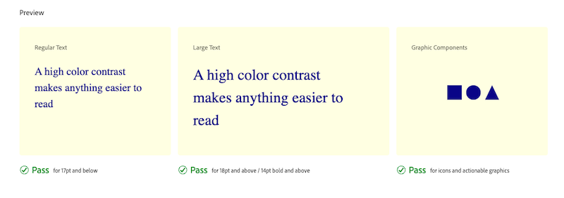
The key is to use color combinations that have a high enough contrast ratio (ideally 4.5:1 or greater for normal text) to meet accessibility standards like WCAG.
Accessible Design Enhances User Experience for Everyone
Accessible design isn’t just about meeting regulations—it’s about improving the overall user experience. Websites designed with accessibility in mind are easier to navigate, more intuitive, and ultimately more user-friendly for everyone, not just those with disabilities.
When designers see accessibility as an advantage rather than a limitation, they create more thoughtful, user-centered designs. We believe that accessible design is good design. Our platform helps you create inclusive, compliant websites that meet the needs of all users—whether you’re building an employee intranet or a large-scale government portal.
Designing with accessibility in mind ensures that your website is inclusive, usable, and enjoyable for everyone.
Additional Reading and Tools
The Complete Guide To Accessible Navigation
What is Web Accessibility and Why it Matters for Better Business
How QR Codes Make Information More Accessible

Sources:
- Venngage. (n.d.). Accessible color palette generator. Venngage. https://venngage.com/tools/accessible-color-palette-generator
- U.S. Web Design System. (n.d.). Color: Overview. U.S. Web Design System. https://designsystem.digital.gov/design-tokens/color/overview/
- Wong, J. (2021, May 4). Color accessibility in product design: A guide. InVision. https://www.invisionapp.com/inside-design/color-accessibility-product-design/
- Simplified Science Publishing. (n.d.). Best color palettes for scientific figures and data visualizations. Simplified Science Publishing. https://www.simplifiedsciencepublishing.com/resources/best-color-palettes-for-scientific-figures-and-data-visualizations
- Oregon State University. (n.d.). Color accessibility. Oregon State University. https://accessibility.oregonstate.edu/color
- Colors. (n.d.). Accessible color palette & contrast options for better design. Colors. https://clrs.cc/a11y/
- AudioEye. (2023, March 23). A guide to accessible colors. AudioEye. https://www.audioeye.com/post/accessible-colors/
- AudioEye. (n.d.). Color contrast checker. AudioEye. https://www.audioeye.com/color-contrast-checker/
The Web Content Accessibility Guidelines (WCAG) set the following standards for color contrast on websites:
- 4.5:1 contrast ratio for normal text (under 18pt).
- 3:1 contrast ratio for large text (18pt or larger) or bold text.
For non-text elements such as buttons, icons, or graphics, the color contrast also needs to be sufficient to ensure all users can distinguish them from the background. These standards are designed to make web content accessible for users with vision impairments, including color blindness and low vision.
ADA-compliant colors are color combinations that meet the standards set by the Americans with Disabilities Act (ADA), which aligns with the WCAG guidelines for contrast ratios:
- 4.5:1 contrast for normal text.
- 3:1 contrast for large or bold text.
While no specific color combinations are mandated by the ADA, the key is ensuring sufficient contrast between text and background. For example:
- Black text on white background
- White text on a dark blue background
- Dark gray text on light yellow background
These combinations ensure that text is easily readable by individuals with vision impairments.
Color palettes for visually impaired people typically focus on high contrast, clear distinctions between colors, and avoiding problematic combinations for color blindness (like red-green). Some recommended accessible color palettes include:
- Black or dark blue text on white or light yellow backgrounds.
- White or light gray text on dark blue or black backgrounds.
- Avoiding red-green combinations, as they are difficult to distinguish for people with red-green color blindness.
For users with low vision, using large text with high contrast, along with simple color schemes, ensures better readability. Tools like Adobe Color’s Contrast Checker can help fine-tune these palettes to ensure they meet accessibility standards.
Certain color combinations can cause readability issues, particularly for people with color blindness or low vision. It’s essential to avoid these problematic color combinations:
- Red and green – Difficult for people with red-green color blindness to distinguish.
- Green and brown – These colors can blend together, making text hard to read.
- Light gray text on white backgrounds – Not enough contrast, causing readability issues for everyone.
- Yellow text on white or bright backgrounds – Very low contrast, making it difficult to read.
Always aim to use color combinations that provide a high contrast between foreground and background elements, and avoid relying solely on color to convey important information.