Have you ever visited a website and found yourself lost in a maze of links, struggling to find the information you need? It's a common frustration that can drive users away. Imagine trying to navigate a massive online store or a university website without any guidance. This is where mega menus come to the rescue.
Have you ever visited a website and found yourself lost in a maze of links, struggling to find the information you need? It's a common frustration that can drive users away. Imagine trying to navigate a massive online store or a university website without any guidance. This is where mega menus come to the rescue.
Mega menus are a powerful tool to improve site navigation and user experience by organizing complex site structures into easily accessible categories. In this post, we’ll explore what mega menus are, their benefits, best practices for implementation, and examples of effective use.
What is a Mega Menu?
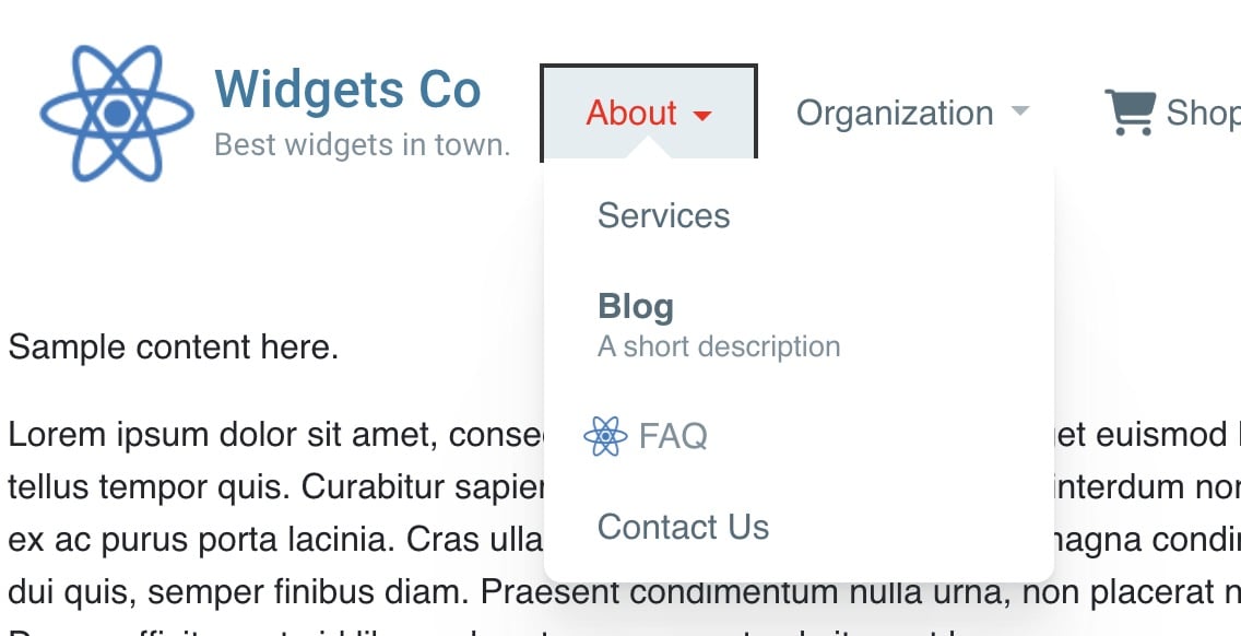
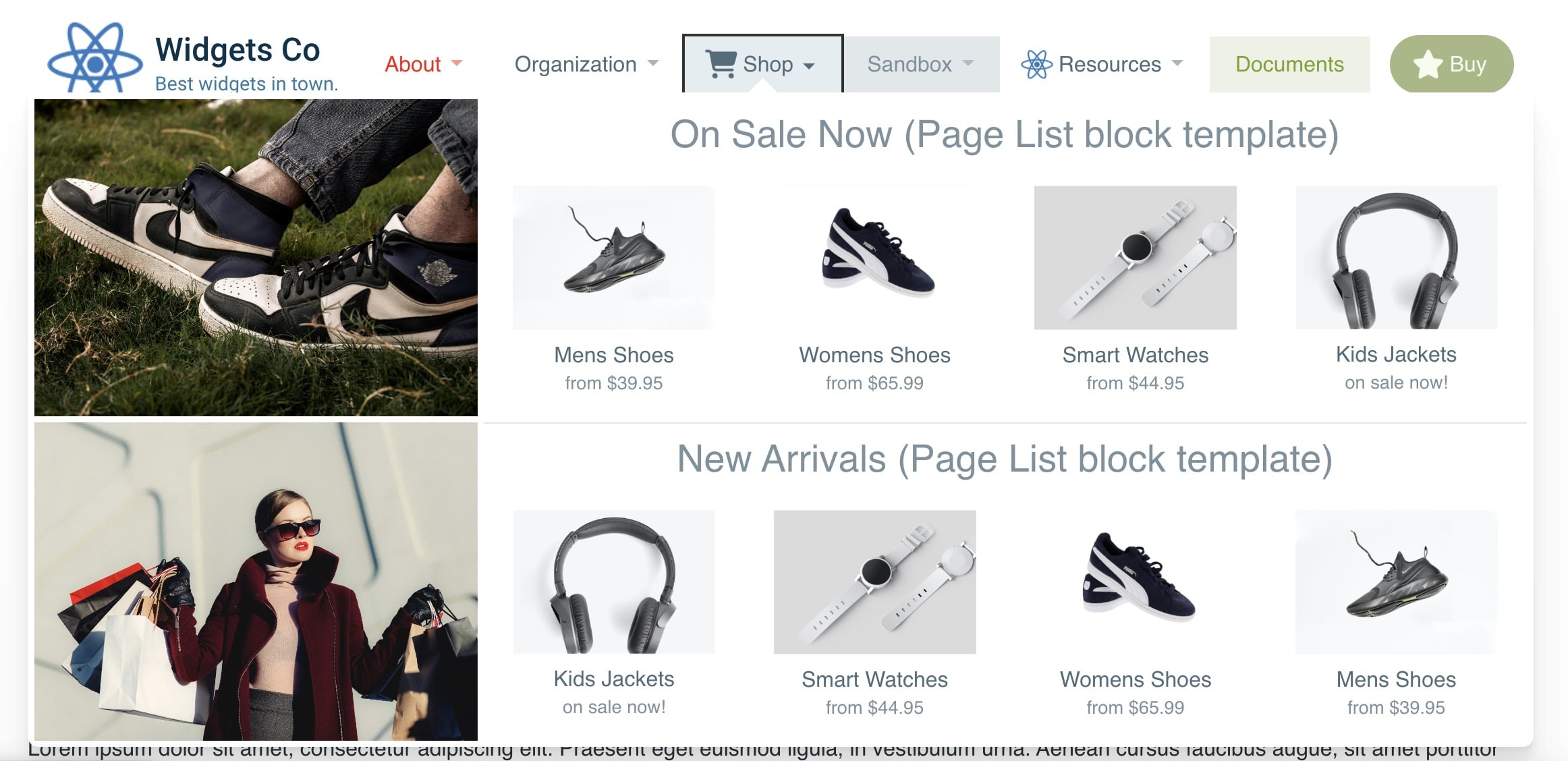
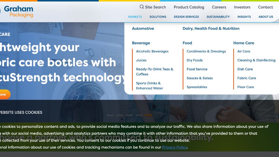
Definition: A mega menu is an expandable menu that displays multiple options and subcategories at once, often in a large, visually appealing dropdown panel. Unlike traditional dropdown menus that typically show a single column of links, mega menus can showcase various links and categories in a structured, multi-column layout.
Structure: The typical layout of a mega menu includes several columns, each representing different categories or subcategories. These columns can also contain images, icons, and other design elements to enhance visual appeal and guide users to the content they seek.
Benefits of Using Mega Menus
Improved Navigation: Mega menus significantly enhance user experience by organizing complex site structures into clear, accessible categories. This organization allows users to find the information they need quickly and efficiently, reducing frustration and improving overall satisfaction.
Visual Appeal: One of the standout features of mega menus is their ability to incorporate images, icons, and other design elements. This not only makes the menu visually appealing but also helps users quickly identify the sections they are interested in.
Efficiency: Mega menus reduce the number of clicks needed to find content, speeding up the navigation process. Users can see all available options at a glance, making it easier to navigate through extensive content without feeling overwhelmed.
When to Use Mega Menus
Content-Rich Websites: Websites with a large amount of content, such as e-commerce sites, large blogs, and news websites, benefit greatly from mega menus. These menus help organize vast amounts of information into manageable sections, making it easier for users to find what they’re looking for.
Multiple Categories: Sites with multiple categories or departments, such as corporate websites or educational institutions, can utilize mega menus to improve organization. By grouping related links and content, mega menus make it easier for users to navigate complex site structures.
User Engagement: Enhancing user engagement and reducing bounce rates are critical for any website. Mega menus help achieve this by providing users with a clear, organized way to find the information they need, encouraging them to explore more of the site.
Best Practices for Implementing Mega Menus
Clear Organization: Logical grouping and clear labels are essential for effective mega menus. Ensure that categories and subcategories are organized in a way that makes sense to users, and use descriptive labels to help them understand what each section contains.
Consistent Design: Maintain a consistent design with the rest of the website. The mega menu should blend seamlessly with your site’s overall look and feel, ensuring a cohesive user experience.
Mobile-Friendly: With the increasing use of mobile devices, it’s crucial to ensure that mega menus work well on all screen sizes. Responsive design techniques can help make sure that your mega menu is accessible and usable on smartphones and tablets. For more tips on designing accessible navigation, check out the Complete Guide to Accessible Navigation.
Testing and Feedback: Regularly test your mega menus with real users and gather feedback to make improvements. Tools like user testing platforms can provide valuable insights into how users interact with your menus and highlight areas for enhancement.
Marketplace Add-Ons to Enhance Your Navigation
Concrete CMS users can elevate their site's navigation by leveraging specialized add-ons available in the Concrete CMS Marketplace. Here is a powerful tool to streamline and improve user experience:
-
Mega Menu: This feature-rich add-on is perfect for organizing complex site structures into visually appealing and easily accessible dropdown panels. It supports multi-column layouts, images, and icons, making navigation intuitive and aesthetically pleasing.
By incorporating these add-ons, you not only enhance the user experience but also streamline content discovery, ensuring visitors find what they need with ease. Explore these tools to transform your website's navigation into a feature that stands out for its usability and design.
Examples of Effective Mega Menus
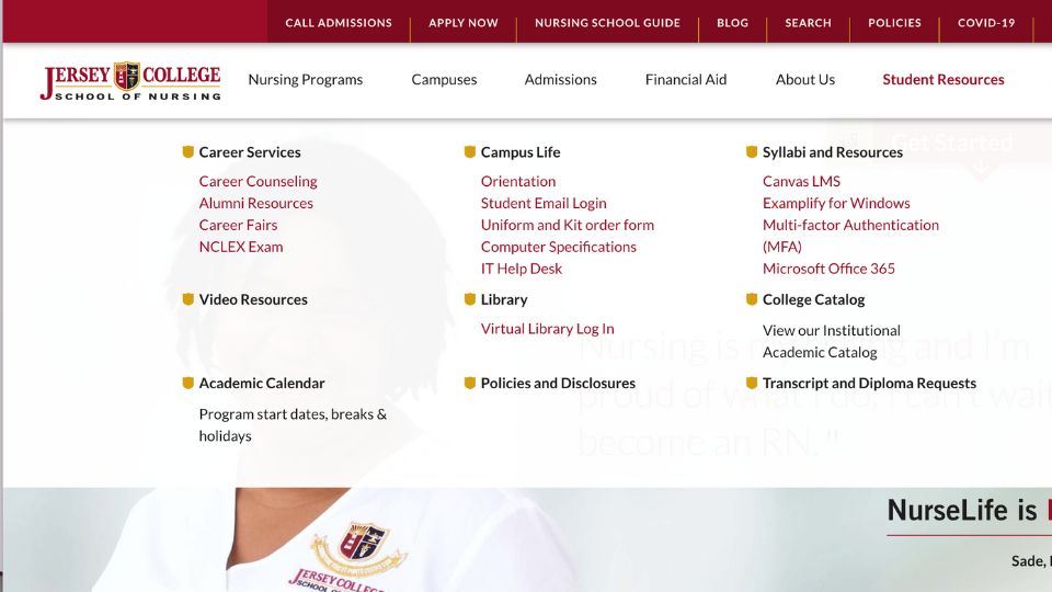
Educational Institutions: Look at how Jersey College uses mega menus to organize student resources. By grouping Career Services, Campus Life, Syllabi and Resources, Library, and more into distinct categories, they provide a clear, navigable structure that helps students quickly find the information they need.
Corporate Websites: Electro-Sensors' mega menu effectively organizes a wide range of products into clear categories like Shaft Speed Switches, Hazard Monitoring, Belt Alignment Sensors, and more. This structure helps users easily navigate through their extensive product offerings.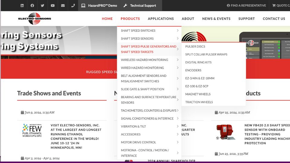
Government Sites: The State Data Center's mega menu effectively organizes a wide range of data and resources under clear categories like Business & Industry, Geography, and more. This helps users easily access the information they need from a broad array of topics.
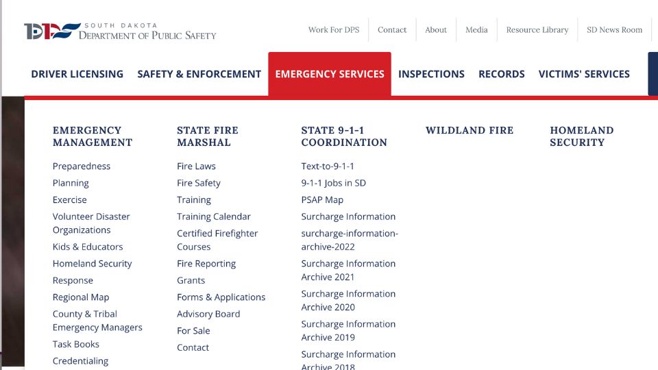
Emergency Services: The South Dakota Department of Public Safety's mega menu categorizes critical services like Emergency Management, State Fire Marshal, and Homeland Security, making it easy for users to navigate essential information and services.
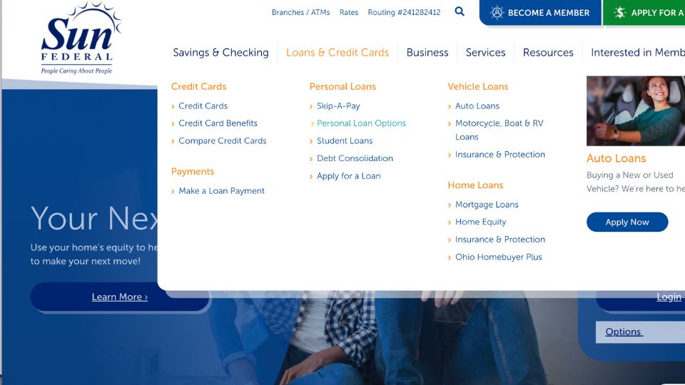
Financial Services: Sun Federal Credit Union's mega menu provides a well-organized structure for various financial products and services, including Credit Cards, Personal Loans, Vehicle Loans, and Home Loans. This layout helps members and potential customers quickly find relevant information.
For more examples and expectations around website navigation, you can read Website Navigation: Expectations, Examples, and Tools.
Common Pitfalls to Avoid
Overcrowding: Avoid adding too many items to your mega menu, which can overwhelm users. Keep the menu concise and focused on the most important links and categories.
Poor Design: Ensure that your mega menu is readable and usable. Use clear fonts, adequate spacing, and a logical layout to make it easy for users to navigate.
Neglecting Mobile Users: Make sure your mega menu is responsive and works well on mobile devices. Test the menu on various screen sizes to ensure a seamless experience for all users.
For more comprehensive guidance on designing effective web menus, you might find the Ultimate Guide to Navigation Bars and Web Menus helpful.
Conclusion
Effective web menus and navigation are essential for providing a seamless user experience, improving accessibility, and enhancing SEO performance. Mega menus are a powerful tool to achieve these goals by organizing complex site structures into clear, accessible categories.
Consider implementing mega menus on your website if you have extensive content or multiple categories. By following best practices for clear organization, consistent design, and mobile-friendliness, you can enhance your site’s navigation and user experience.
Further Reading:
- The Ultimate Guide to Navigation Bars and Web Menus
- Website Navigation: Expectations, Examples, and Tools
By continually refining your web menus and navigation, you can create a positive and efficient browsing experience that keeps visitors coming back.

